Project Reveal: Cloud Course Bathroom Remodels
- Gina
- Mar 7, 2023
- 3 min read

From light and bright tile + marble for the kids' bathroom, to herringbone tile, marble + navy blue wallpaper for the primary bathroom, our client had well-honed visions for the bathroom remodels in her Corte Madera home. But the sheer number of decisions involved in remodeling bathrooms left her second guessing her plans. Enter our team (we love these details and decisions!). Since we had a good jumping off point, we focused on making functional changes, practical recommendations, and of course beautiful designs to create two unique bathrooms that speak to each other.
First, let's dive into the kids' bathroom. Take a look at where we started!

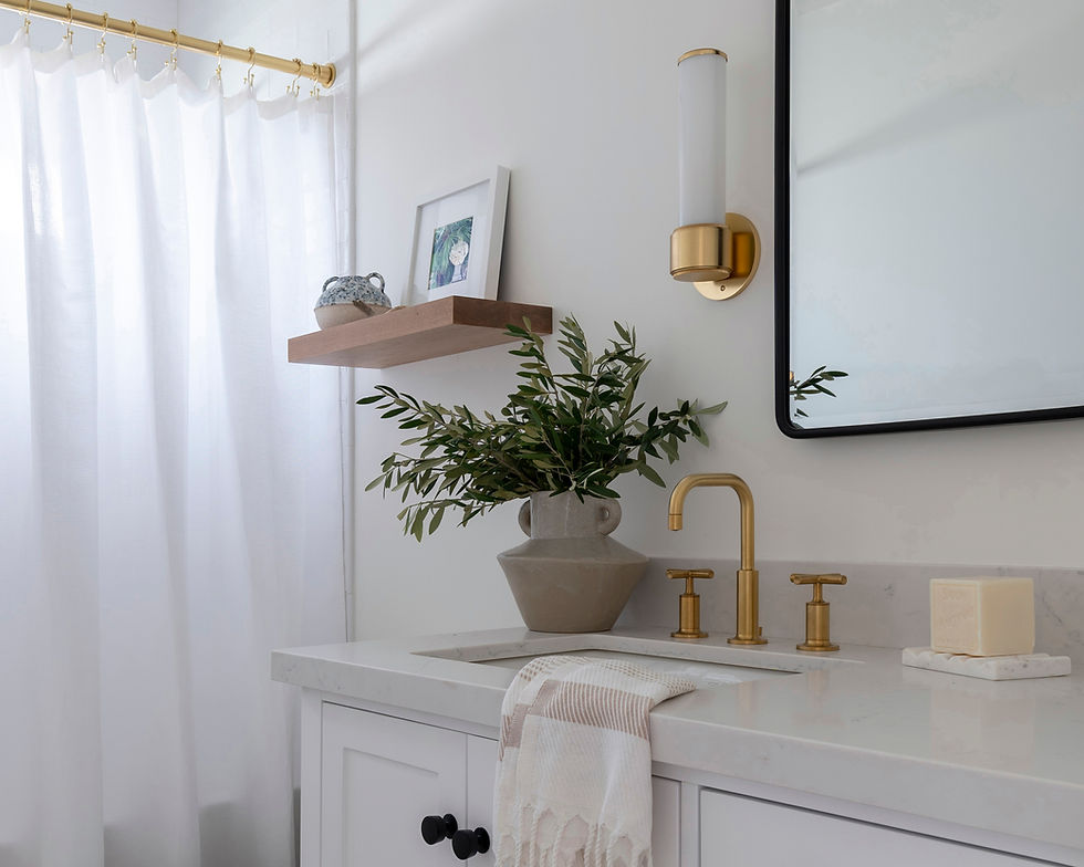
The kids' bathroom didn't have enough storage and the tub was pretty shallow. This is the only tub in the home, and where they wash their adorable puppy too, so a deeper tub was a must! To address the storage issues, we used a larger vanity with multiple drawers, a recessed medicine cabinet, and added a large niche.


The niche was framed out in the same quartz that was used for the vanity top, a beautiful and unexpected element that we love! Sticking with the light and bright vibe of this bathroom, the glossy white subway tile has some dimension to it that beautifully reflects light in the space.

The black vanity hardware, black framed medicine cabinet, and white oak floating shelf add interest and depth to this neutral kids bathroom!
Now onto the primary bathroom. Here's where we started:


Incredible that these two pictures show the same view, right?! In the primary bathroom, our client really wanted to incorporate navy. So we went bold with a navy vanity + striking navy wallpaper that looks like it was painted onto the walls. We balanced these bold choices with white subway tile in a herringbone pattern, white quartz with simple veining, and the most beautiful marble lookalike hex tile on the floors. We ultimately recommended durable quartz and ceramic materials instead of marble for the durability and consistent look over time.

We continued the hex flooring into the shower pan to elongate the space. Just like in the kids' bathroom, the glossy white subway tile helps to bounce light around the room and brighten the space.
Storage was also an issue in the primary bathroom, and the small footprint of the space made it feel very cramped. We made the space more functional by swapping the pedestal sink for a vanity cabinet with counter space, adding a large niche, swapping out the shower curtain + rod for a glass enclosure, and we also stole 14" from her closet to widen the shower. Closet space is always a premium, but in this case, the shower was tiny and the additional 14" made a huge impact on the functionality and feeling of the primary bathroom.

The differences in these two bathrooms stand out, but did you notice the similarities? We intentionally used the same plumbing, same tile shapes, and same quartz material in both spaces so that they speak to each other and work well together in the same home! You can view even more photos of this project in our portfolio.
Have you been putting off remodeling or furnishing your home? Let our Marin County interior design firm manage the details so you don't have to! Get in touch to discuss your home.
Photography by Jessica Brydson.
Comments